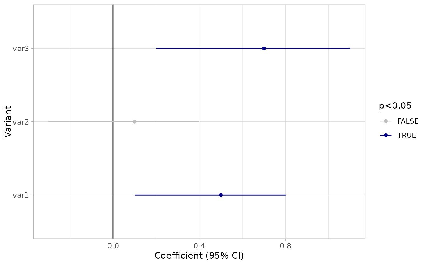
This function creates a ggplot object visualizing logistic regression coefficients with their 95% confidence intervals. Significant markers are highlighted based on a specified p-value threshold.
Usage
plot_estimates(
  tbl,
  sig = 0.05,
  sig_colors = c(`FALSE` = "grey", `TRUE` = "blue4"),
  x_title = "Coefficient (95% CI)",
  y_title = "Variant",
  title = NULL,
  axis_label_size = 9,
  marker_order = NULL
)
Arguments
- tbl
A data frame or tibble containing the logistic regression results. Expected columns are:
marker: The name of the marker (e.g., variable name).pval: The p-value for each marker.ci.lower: The lower bound of the confidence interval.ci.upper: The upper bound of the confidence interval.est: The estimated coefficient.
- sig
(optional) The significance threshold for p-values. Defaults to 0.05.
- sig_colors
(optional) A vector of two colors to represent significant and non-significant estimates.
- x_title
(optional) The title for the x-axis. Defaults to "Coefficient (95% CI)".
- y_title
(optional) The title for the y-axis. Defaults to "Variant".
- title
(optional) The main title of the plot. If NULL, no title is added.
- axis_label_size
(optional) The font size of the axis labels. Defaults to 9.
- marker_order
(optional) Vector indicating the order of the markers to be plotted on the y-axis.